
Color and contrast
Effective use of color and sufficient contrast are fundamental concepts that can support digital accessibility in all of your content.
Color contrast is the difference in brightness between text or important visuals and the background behind it. Sufficient contrast makes content easier to read for people with low vision, color blindness, aging eyes, or when viewing on mobile devices or in bright environments.
Color should never be the only way information is communicated. If someone cannot perceive a color difference, they may miss the meaning entirely.
Use a tool like the WebAIM contrast checker to test the contrast ratio of your content. The Web Content Accessibility Guidelines (WCAG) 2.1 AA requires digital content meet the following minimum contrast ratios:
- Normal-size text – 4.5:1
- Large text (18+ pt font) – 3:1
- Interactive or graphic elements like icons, buttons, and text boxes – 3:1
The following images show the contrast checker results for a blue button labeled “Schedule appointment.” The button colors meet WCAG AA standards, which is sufficient for our compliance goals.

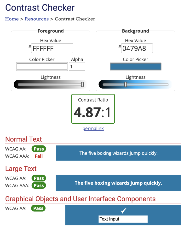
Even if text and element colors are distinguishable from the background, they may not always be distinguishable from each other. Do not rely on color alone to communicate information (for example, avoid color-coding). Use other indicators like text labels, patterns, and shapes.
- Use a contrast checker on text and other visual elements
- Minimum contrast ratios:
- Normal size text – 4.5:1
- Large text (18+ pt font) – 3:1
- UI elements like icons, buttons, text boxes – 3:1
- Avoid using images behind text
- Use a solid-color background to get a better contrast ratio with text
- Avoid relying on color to convey information
Fundamentals












Download the checklist
Download the digital accessibility fundamentals checklist PDF to help you keep track of the core principles of accessibility while creating and editing digital resources.
Get help from the Center for User Experience (CUE)
We partner with you to create accessible, usable, and inclusive digital spaces through free evaluations and consultations.